
FITNESS AND WELLNESS
CREW TRAINING CLUB
Branding a Fitness & Wellness Community Built Around Confidence, Consistency, and Connection
Branding a Fitness & Wellness Community Built Around Confidence, Consistency, and Connection
AT A GLANCE
Premium
Fitness & Wellness Branding
Complete
Brand Identity System
Editorial
Creative Direction
Multi-Platform
Visual Identity

THE BACKGROUND
a fitness brand
BUILT TO FEEL LIKE A COMMUNITY.
Crew Training Club came to DRLN with a vision to create more than just a workout space. They wanted to build a fitness and wellness brand centered around confidence, consistency, and connection.
The goal was to create a visual identity that felt elevated and modern while still maintaining a warm, approachable energy.
The challenge wasn’t simply creating a logo. It was building a cohesive brand system that could support both digital and in-person experiences while helping Crew stand apart from traditional fitness branding.
WHAT WE FOUND
THE GAP
Brand positioning: Needed a stronger identity beyond a traditional gym aesthetic
Visual consistency: No fully developed branding system across platforms and materials
Creative direction: Needed a modern, editorial-inspired visual language
Audience connection: Brand needed to feel motivating without becoming intimidating
Scalability:Identity needed to work across social, signage, merchandise, and future growth
OUR APPROACH
ONE BRAND. ONE IDENTITY. BUILT FOR LONG-TERM GROWTH.
We developed a complete branding system designed to position Crew Training Club as a premium wellness and lifestyle brand rather than simply a fitness facility.
-
01
create a complete visual identity
Primary and secondary logos, typography, brand colors, and supporting graphics designed to work cohesively together.
-
02
develop a modern creative direction
A visual identity inspired by editorial design, wellness culture, and elevated lifestyle branding.
-
03
build for both digital & physical experiences
A system flexible enough for social media, signage, merchandise, and member communications.
-
04
balance strength with approachability
Branding designed to feel motivating and premium while still welcoming and community-focused.
-
05
create a timeless aesthetic
A visual direction designed for longevity rather than short-term trends.

01 — BRAND IDENTITY DEVELOPMENT
they needed more than a logo.
WE BUILT A BRAND SYSTEM.
Crew needed a cohesive identity that reflected the energy and experience behind the business.
We created a visual language that feels elevated, clean, and community-driven.
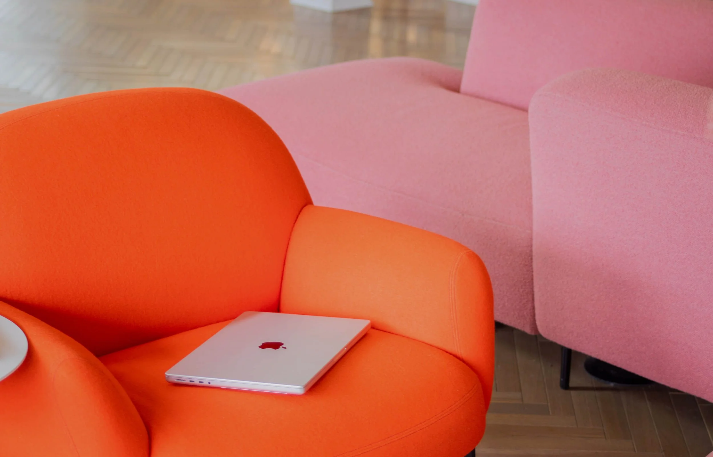
The final branding system combines structured layouts, minimal typography, rich neutrals, and lifestyle-focused imagery to create a brand that feels modern without losing warmth.
BEFORE
No cohesive visual system
Limited brand consistency
Traditional fitness branding direction
AFTER
Complete identity suite
Editorial-inspired creative direction
Flexible branding across digital and physical touchpoints
RESULTS
Complete
Brand Identity System
Editorial
Views on top-performing Content
Scalable
Visual System for Growth

02 — CREATIVE DIRECTION
WELLNESS BRANDING SHOULD FEEL ASPIRATIONAL. NOT INTIMIDATING.
The creative direction focused on building a balanced identity that reflects both movement and lifestyle.
What We Built:
Rich neutral color palette with energetic accent tones
Bold, minimal typography
Editorial-inspired imagery
Structured, clean layouts
Lifestyle-focused wellness visuals
Every visual decision was designed to support a polished, recognizable, and premium experience.

03 — BRAND EXPERIENCE
EVERY TOUCHPOINT SHOULD FEEL connected.
The branding system was designed to extend beyond social media and work across all brand experiences.
Social media direction
Merchandise and apparel applications
Signage and in-studio visuals
Marketing materials and promotions
Member communication assets
This creates a cohesive experience whether someone interacts with Crew online or in person.
04 — THE OUTCOME
A BRAND PEOPLE WANT TO BE part of,
Crew Training Club now has a branding system that reflects the energy, confidence, and sense of community behind the business.
The identity captures:
Elevated wellness culture
Strength and confidence
Modern lifestyle branding
Community and belonging
Rather than following temporary fitness trends, the brand now feels timeless, recognizable, and built for long-term growth.

A BRAND BUILT
TO GROW WITH THE BUSINESS.
The final identity positions Crew Training Club as more than a gym. It feels like a lifestyle brand people genuinely connect with.
-
the brand builds community
A visual identity designed around confidence and belonging
-
the creative builds recognition
Consistent visuals that feel polished and elevated
-
system builds scalability
Flexible branding that works across every touchpoint
-
the experience builds loyalty
A cohesive identity that people want to engage with both online and in person